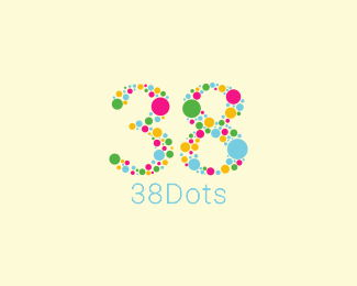
I really like this logo because it is appealing to the viewer because of the variety of colors. Although the logo is very simple because it incorporates a variety of dots that use different colors makes the logo more complex. The logo does not appear to follow any particular pattern for how the colors are arranged. Even though it does not follow a pattern this results in the logo having a variety of color dots in different positions, allowing your eyes to explore the logo with your eyes. Since some of the dots are larger than others, the larger ones draw more attention since they pop out more. I think this a good idea because it draws our eyes to the large dots and eventually allows us to look around at the other dots.

No comments:
Post a Comment